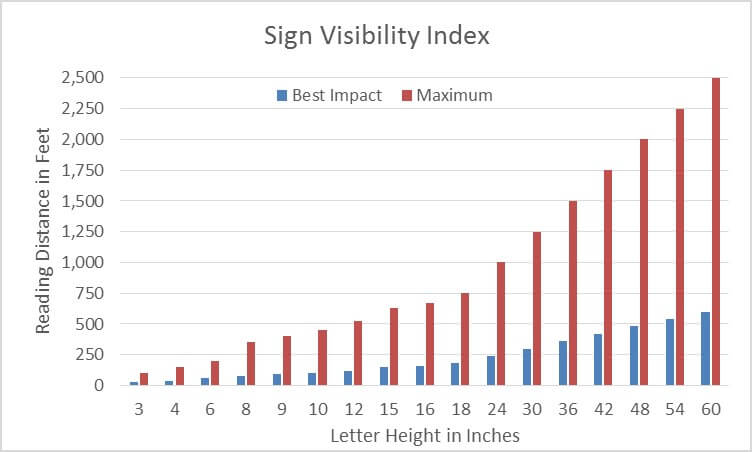
We commonly are asked about the size a lettering should be used when making custom signs. We have created a quick reference guide when considering the sizing of your sign’s letters. While this acts as a quick reference, there are additional factors that should be considered when deciding on your signage. Additional factors that can impact your sign’s legibility to consider are:
 Letter style: Thinner letters are more difficult to read compared to a bold font which comes across more clear. The font your business selects should be easy to read and not include too much space between each letter. In typography, this spacing between each letter is referred to as kerning. Letters too close or too far apart become more difficult to read quickly.
Color of letters and background: Letters with higher contrast are easier to read. Often a color combination online might not translate as well to an actual sign. Our designers can work with you to create a sign that will be readable and have enough contrast while matching your company branding.
Lighting conditions: Signs installed in dark areas will benefit from bold large letters. Ask about our reflective materials if you have a sign that will be hung in a darkly lit area near a road. For non-reflective signs, we also offer a wide range of indoor and outdoor lighting that will match any building or structure.
 Location: Will your sign be indoor or outdoor? If outside, it’s important to determine if the sign will be placed near a road and the speed limit. This will help determine how large the sign needs to be in order to be visible to oncoming traffic.
Your designer will consider these factors when creating the optimal letter height for your application. This is to ensure that we provide the most cost effective solution in order to Create Impressions that Last Forever. Contact us today by phone at 253.243.7777 email info@pugetsoundsigns.com or fill out our information request form, and begin planning your custom sign.